
weekly delights #45
The problem with periwinkle-- hyper fixations take us down the strangest rabbit holes!

Buckle up. This is going to be a random one. Below the paywall we will discuss complicated relationships with colors, a great movie I watched this week I’d recommend to fans of the HBO series GIRLS, recipes I’ve been making on repeat, and just a life-in-pictures up date. Probably some second hand shoppable links, art I can’t stop staring at, and Fashion Thots™.
With that, let’s get stuck in.
Periwinkle Blue
Do you ever get color-based hyper fixations, or are you normal? Maybe it’s my contrary side expressing itself, but in a world determined to suck the lifeblood out of the phrase “timeless wardrobe staples” and dress everything in khaki trench coats, I’m feeling reactionary.
This happens to me occasionally, where a color will lodge itself into my psyche, and I can’t rest until I fit into my life SOMEHOW. It started, like it always does, quite innocuously. I picked up some new taper candles for the mantle and found myself drawn to these lovely periwinkle colored ones.
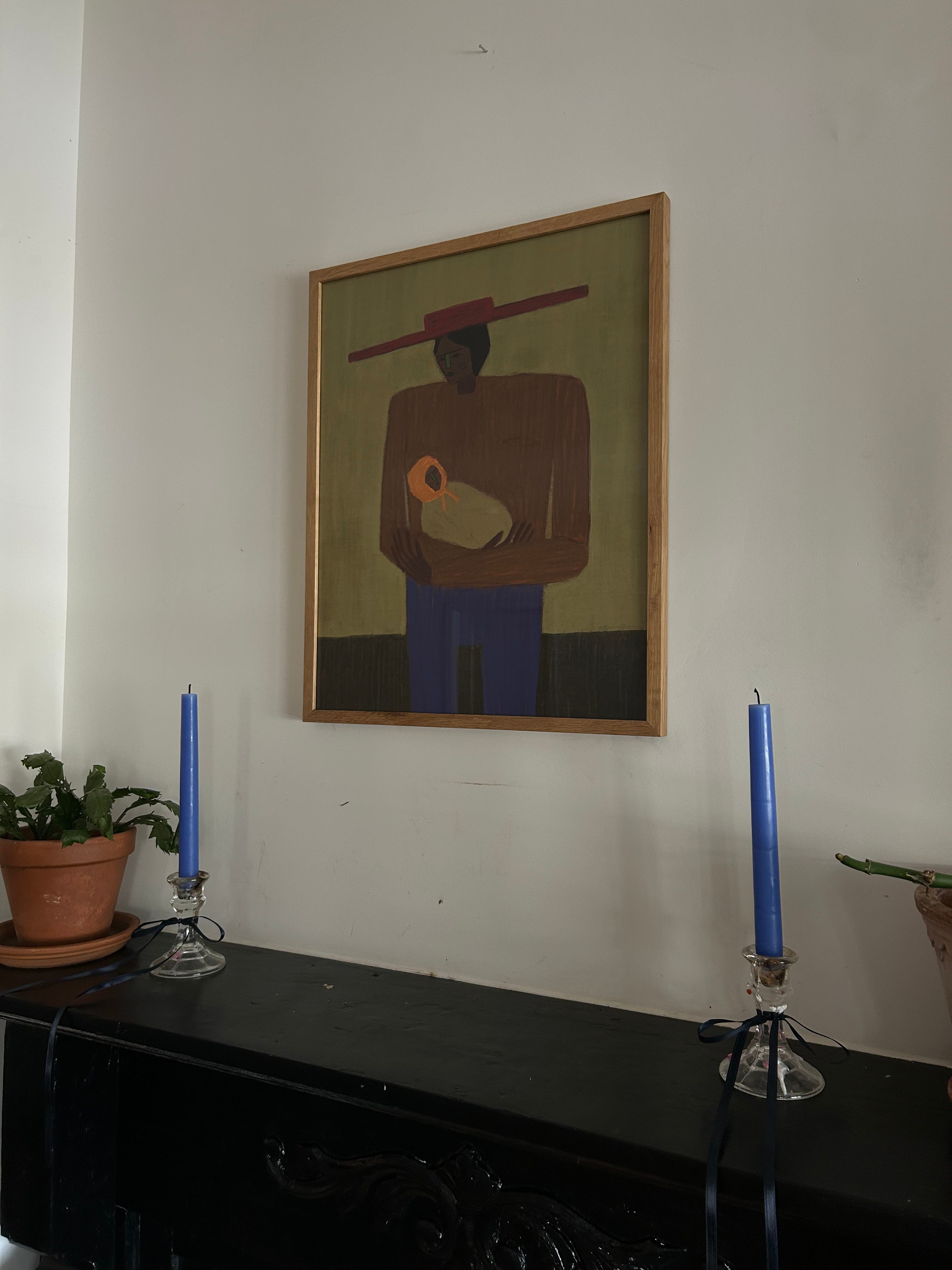
I love how unexpected they feel. Most of my living room is decorated in neutrals, browns, blacks, and tans. I unapologetically love white walls, and so to counter this tendency, I like to inject pops of color in throws, pillows, art, etc. That’s what these candles were for me. But then I started to notice myself looking up from my reading in the evenings just thinking “God, these are just such a pretty color.”
Which, I found surprising because I’ve never been a “purple girl”. Red, yes, blue, yes, purplish blue??? Periwinkle is in the same class as lime green, teal, and lavender: all colors middle school girls think they’ve discovered.
And yet, these periwinkle candles have been such a visual delight this week I had to go down the rabbit hole— the periwinkle blue rabbit hole to be precise. Here’s some of my findings:
Art
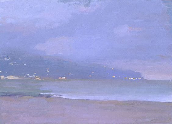
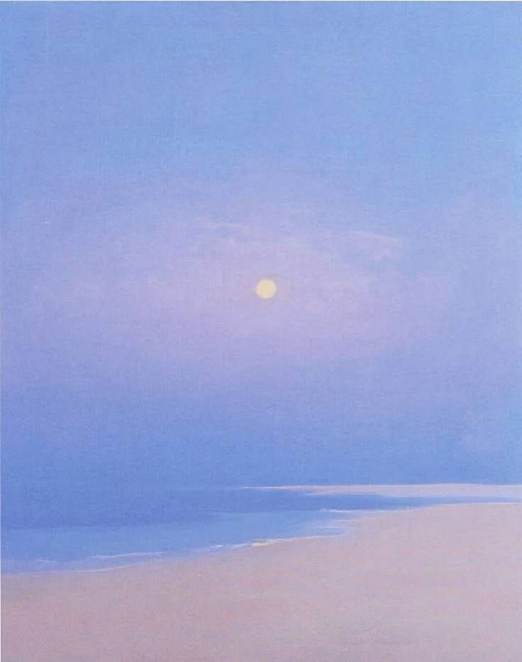
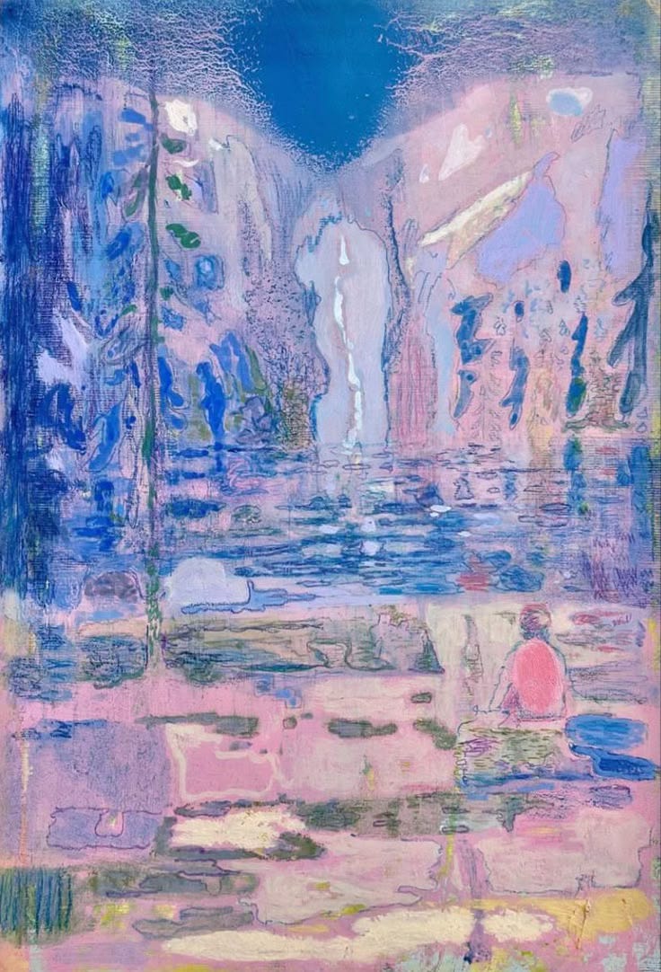
That’s when I realized part of what I think I’m drawn to about periwinkle is that it’s the color of dawn and dusk, where fire meets sky, a color that represents expanse. It’s not the color of a middle school girl’s bedroom, it’s the color of nature painting the sky. It’s the color of sunset reflected on the water, that quality of light that appears just before the sun slips down the horizon.
I wanted to bottle that feeling! I wanted experience that color everyday, so I started looking up periwinkle online and very quickly remembered by it’s been officially labeled as a “Bad Color” for me for years.

While technically periwinkle, none of these garments capture any of the awe and space and magic those paintings above do. Maybe, I thought, periwinkle isn’t a color to be worn? Maybe the reason it feels so magical is because of its elusive quality? To me, periwinkle almost feels more like a texture than a color when it’s in nature. And then when it’s materialized, it completely falls short.
Can periwinkle be tastefully incorporated into an aesthetic without feeling kitschy or immature?
TL;DR— I think yes, but it requires thought. All opinions are my own, I’m not a color expert, just someone whose hyper fixation this month is a bit random. Let’s go.


Okay, without being weird about it, I think this nail color looks much more striking and “at-home” on the black model’s hand, than it does on the white model. My reasoning is that it goes back to the textural nature of periwinkle, and why I’m drawn to the color. On the black model, we see they have skin gradient from their palm to the outer edges of their fingers, to the top of their hand. To me, periwinkle shines when it’s plays with texture and gradient of light, and falls flat as a static color.
On the white model, there’s no gradient in their skin, at least how it’s photographed here. As a result, the color looks flat and lifeless. To my tastes anyway.
Next.


Now, I recognize not all of these shades of periwinkle are the same color. Some are more blue, some are more purple, but to me they’re all in the same family.
To my taste, none of these are quite hitting. Again, I think it comes back to the flatness of the color when it’s saturated like that. These are the best examples I could find, and I think each of these rooms are styled beautifully with lots of natural textures (wooden floor boards), pops of red, and in general embracing the drama of a bold color choice. They’re just not my thing.
However, I think in photo #1, I like the two-toned paint pairings between the wall and trim color. I think that helps it feel more dynamic. (But I hate that sconce— sorry! In general the design choices in that room feel way too traditional to support the whimsy of the wall color, imo.)
In photo #2, I respect the minimalism. The wall color IS the decor. And both designers in #2 and #4 have included a dimmable globe light which I think fits the color choice so well. The room in #2 feels the most like periwinkle light at dusk FEELS. Again, I’m too much of a boring, white wall, zen bedroom fan to get on board, but respect.
Room #3 reminds me of Monica from FRIENDS apartment! (complimentary!) I like that the designer leaned into the low-light nature of the room and went with a darker color. Could I happily sit in a periwinkle library at night and read my book? I can’t make that call confidently as this point.
Room #4 feels too staged for me. But I like that they paired a purple painting and red chair with the wall color. As a result, both those choices stand out all the more. I think I would have liked it better if the bookcase was another color. Or left natural.
Next.


Ahhh okay now we’re getting somewhere. In all these spaces, periwinkle is made more dynamic by adding texture! I love how the walls are lime washed, or at least streaky. In photos #1 and #2 they’ve gone with minimal the decor, which I appreciate. I love the wrought iron side table, the purple framed mirror, the pop of purple from the chair. In both spaces they’ve leaned into the natural quality of periwinkle by incorporating art from nature— clouds in #1 and a dragonfly in #2.
But probably #3 is my favorite iteration. White walls— we’re not surprised by this— and playing with the fabrics as a way of creating dimension. The shine off the boudoir bench, the way the bedding almost seems to mimic a sunrise with the shades of blue, red, and purple. I love this room.
The next question you’re probably asking yourself (okay it’s just me wondering)— CAN I WEAR PERIWINKLE?
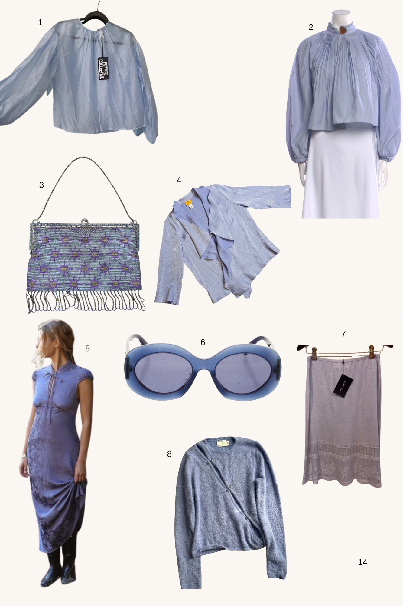
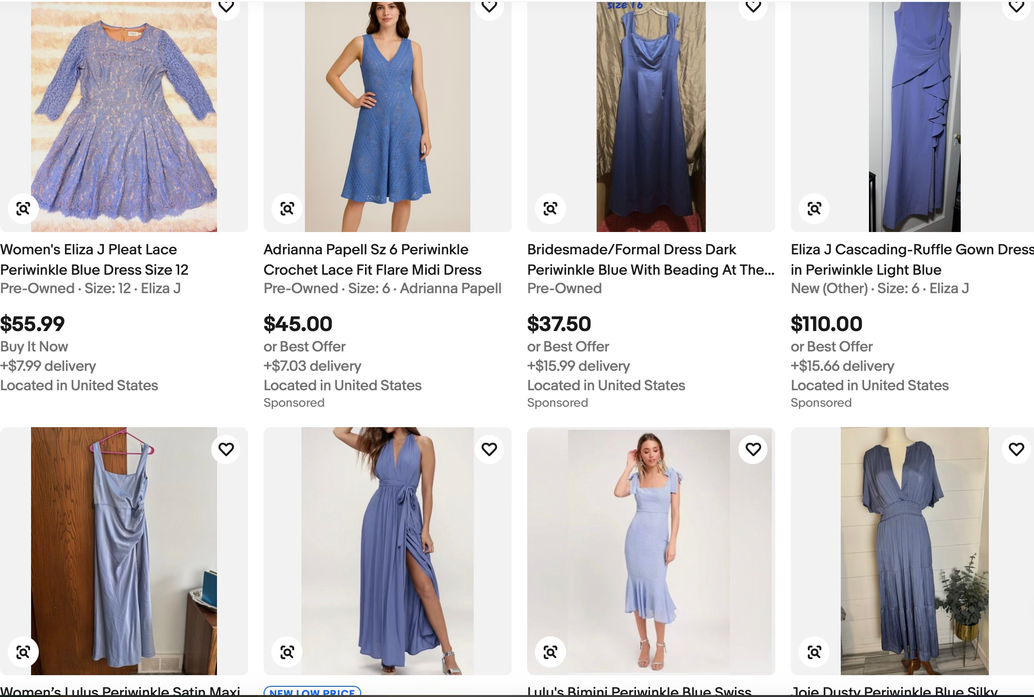
I discovered very quickly that a) there isn’t much out there in periwinkle, b) much of it is rarely TRUE periwinkle before veering off into purple or blue. But these are some of the items I found that feel in the spirit of the color, without feeling like garments that turn you into an early 2000s JcPenny’s model.
Tibi Mock Neck Long Sleeve Crop Top (XS) $75
Antique French Micro Steel Bead Purse Vintage Metal Beaded Fringe Flapper Bag $90
RUBY Rd Periwinkle Soft Sparkle Waterfall Cardigan Ruffle Fairycore Softgirl NWT $24
Portofino Maxi Dress $208
The truth is, I don’t know if you can wear periwinkle. I think it’s a fickle color that looks good on certain people in certain lights in certain types of fabric. It’s not like denim that looks good on everybody. Or a white shirt. Or any of those basics we’ve come to rely on so much.
But I do think it would be a fun color to experiment with, in adding an unexpected, ethereal element to an outfit. If you have something you love to wear in this color or buy any of the pieces above, lmk. I’m so curious!!
I’ll leave you with this beautiful essay on the color periwinkle by Katy Kelleher for the Paris Review, where she writes about the historical origins, and making of this elusive color (spoiler— it includes snail mucus!!!)
